
The Power Puzzle: An In-Depth Analysis of Energy Usage in Belgium
This article provides an in-depth analysis of energy usage in Belgium, including patterns in energy consumption and production, and an examination of the different types of energy sources being used. The article includes dynamic graphs and statistical analysis of the data.

Welcome to our data story on the power grid in Belgium! Energy consumption and usage are critical factors that impact our daily lives, economies, and the environment. Understanding how we consume energy, the patterns we follow, and the impact it has on our planet is essential to building a sustainable future. In this data story, we will use data from Elia to analyse the different grid load patterns, examine how the different types of energy sources are being used and get some cool statistics out of the data.

Time patterns in energy usage
First, let’s have a look at some patterns in our energy usage. We all know that we use more energy during the day compared to the night and it feels like we need more energy during winter. But personally, I never had a look at the numbers or had a feel of how much the difference actually was. So I found some data on the Elia website, put it in Marple and found some interesting patterns.
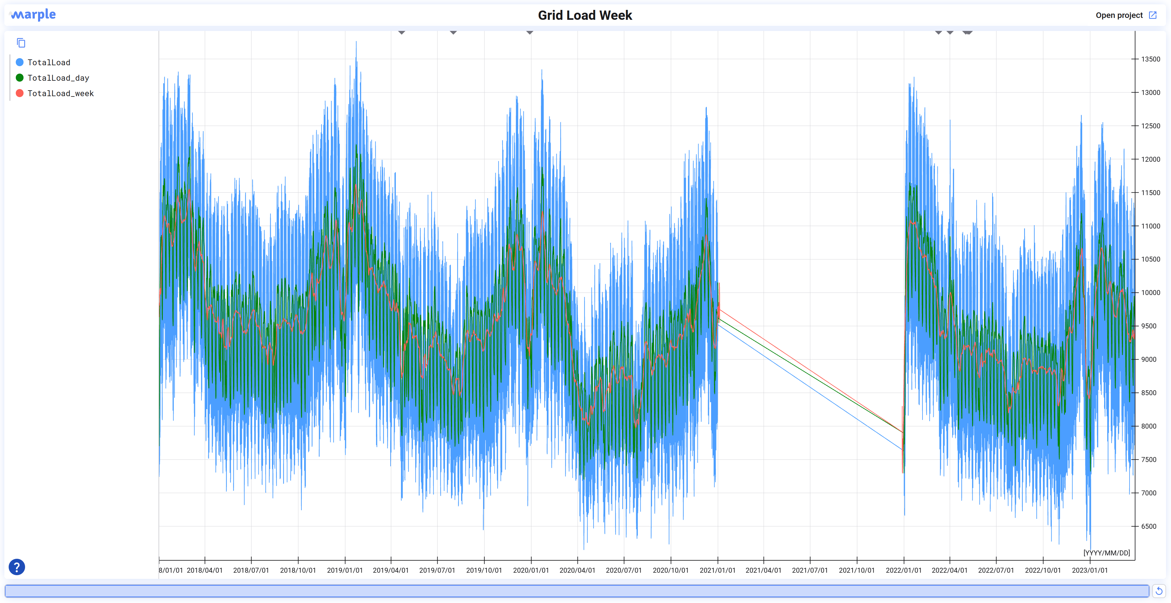
For this analysis, I will have a look at the week from 2/05/2022 - 9/05/2022. I zoomed in on this week on the interactive graph above. Feel free to have a look around at other timeframes! You will notice that a big part of the data for 2021 is missing. (Elia? Do you know why?)
Daily cycle
We can identify two different cycles during the day:
- Day vs night
- Morning vs evening

As expected, we can clearly see that during the night we use a lot less energy compared to the day. Between 3h-4h at night we reach the minimum power demand on our net. Still, even at night, we use 7,000 MW (7GW). From 7h-23h we are in the day cycle and for the week we selected the average load on the net is around 10,000 MW. Higher than during the night, but I expected the difference to be larger.
The second pattern we see is the morning vs evening pattern. We can see that in the morning there is a large peak of energy demand at around 10:00. It drops slightly until there is another (but lower) peak at 19:00. When looking at other weeks as well, we can see that the morning peak is very consistent, but the evening peak is less consistent, both in time and size.
Weekly cycle

Looking at the weekly cycle we can see a clear cycle between workdays and weekends. The first five days of the week are fairly consistent, at the weekend we see a big drop in energy usage. What I find particularly interesting is the fact that also the nights at the weekend are lower compared to the nights during the workweek.
The weekends also have two daily peaks, but as you might expect they appear later in the morning. On Saturdays, the morning peak is around 11:00 while on Sunday this is at 12:00. So we can confirm from this data that people sleep in on Sunday!
One more thing I noticed is that there is no evening peak on Friday, but the energy demand is spread across a wider time range. It does make sense that Friday night is a bit special ;)
Yearly cycle
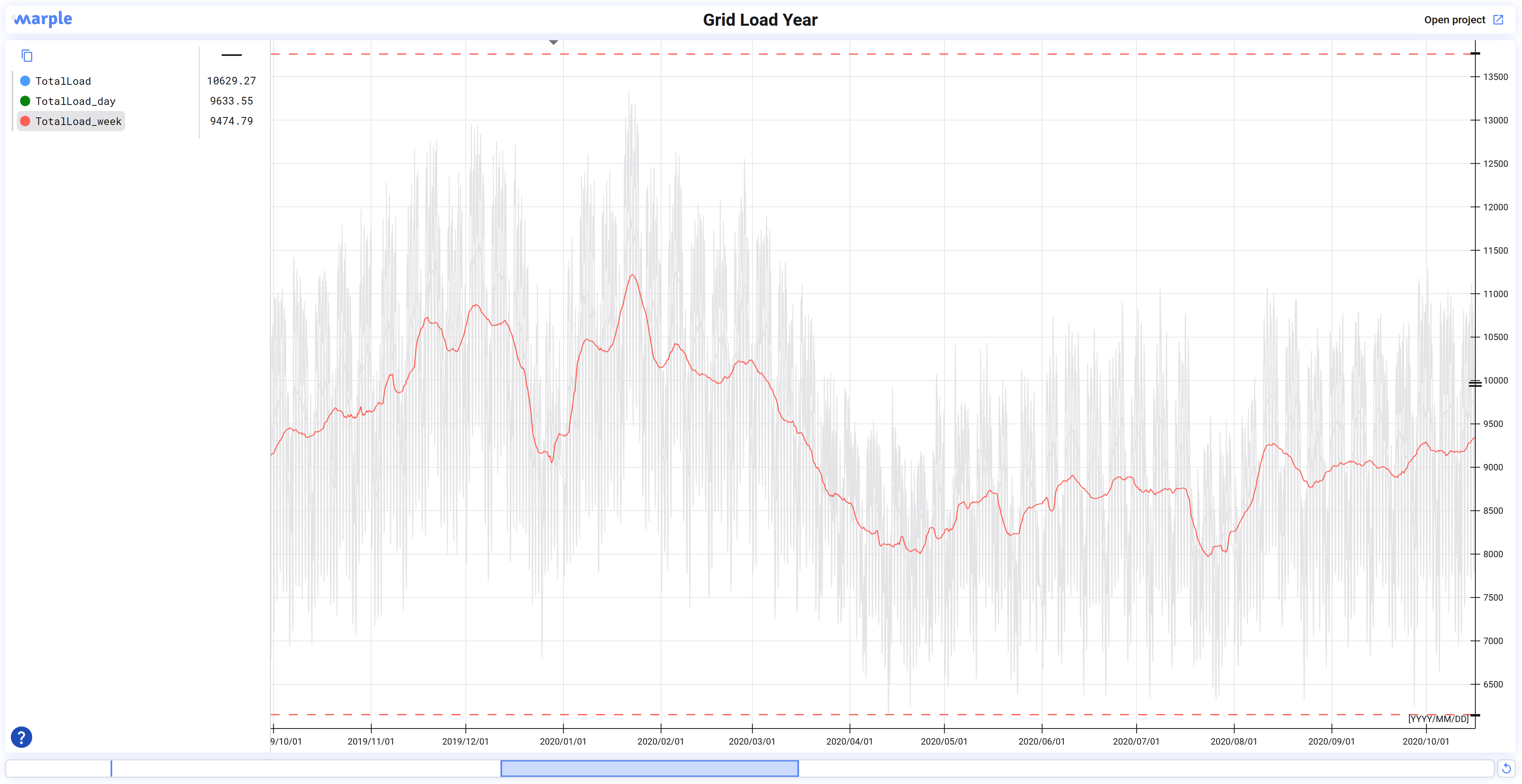
For the analysis of the yearly cycle, I will zoom out to the data from 2019 and take a bit of margin left and right. I also highlighted ‘TotalLoad_week’ which is a moving average that takes the average over a week. This makes it easier to analyse the yearly cycle. We can identify 1 big cycle: summer vs winter.

We have a peak power demand at the end of January and a minimum power demand around the beginning of August. There is about a 35% difference between the two peaks.
You might wonder, what are the big drops in power in the middle of the winter and around April? I was very surprised to see this as well. It looks like the holidays have a big impact on energy consumption in Belgium. During the period around Christmas, there is a 20% drop in energy consumption, for the easter holidays this is around 10% and in summer the power demand is lower anyways so the reduction is only around 4%. I wonder what this looks like in other countries!
I made a note of the Christmas holidays, easter holidays and summer holidays.
Energy production patterns
Elia also provides data about how much power is being generated by different sources energy. The different sources that are listed are coal, gas, hydro, liquid fuel, nuclear, solar, and wind. For this analysis we will use the period from 09/03/2022 - 01/04/2022 as a reference.

As you can see in Belgium we have a big mix of different power sources being used. The graph looks a bit like a spaghetti, so make sure to highlight some of the signals to understand what is going on. You can highlight signals by clicking on the signal name.
When going through the data I have learnt a few things:
- Nuclear power provides half of the energy in Belgium and is super steady.
- Solar power is actually quite predictable, wind power varies a lot.
- We have hydropower in Belgium!
- Hydropower is used to offset solar power in the morning and the evening.
- Natural gas works in synergy with wind power but also covers other deficits.

In the graph above you can see how solar power and hydropower are working together. Mainly when the sun sets, hydropower takes over until the power demand drops. Often this is not enough, and also gas is used to cover the gap.

In the graph above you can see that wind power has a large impact on how much gas is used. Wind power is less consistent, but it does not seem to correlate with solar power.
Some statistics
So far we have looked at different trends and patterns in our energy usage and how the energy was produced. For this, we had a closer look into the actual time series data.
In this last section of this data story, I would like to share some stats & numbers across all the data being used here. For that we can use Marple's data miner, to quickly perform some calculations on the data.
Winter vs summer energy usage
Taking all the data and grouping them per month gives us an indication of the average power usage per month. We can see that during winter there is a higher power demand compared to the summer. If we take the period from May until October, we see an average power demand of 9088 MW. From November until April, the average power demand is 9880 MW. This is only a difference of about 8.7%.

Day vs night energy usage
We already had a look at the daily cycle before, but that was only for one week. In this analysis, I use all the data available and group by the hour. We can see that our initial analysis was correct: there is a peak power demand in the morning and a peak power demand in the evening. During the night (23:00 - 06:00) we have an average power consumption of 8279 MW, while during the day we require 10015 MW.

Total energy produced by every source
Looking at the graphs we get an indication of what power source is used most but given the dynamic behaviour of the data, it is useful to have a look at what the total energy produced per source is. Unsurprisingly we see that Belgium relies most on Nuclear energy which accounts for 51.3%. I am surprised to see that gas accounts for 25.4% of Belgium's energy production, while wind and solar are only good for 8.6% and 6.0% respectively. We do see that more wind and solar energy is being produced every year, so the results might be skewed as we also take data from 2018 into account.
.png)
Solar, wind and hydro vs time of day
One problem with solar and wind energy is their availability. While energy sources such as nuclear and gas are always available (or at least predictable) solar and wind do not have that benefit.
For solar energy, we do have a quite clear schedule when the sun is active. It comes as no surprise to see that when we make a histogram of the solar power produced per hour we see a very consistent result.

Wind power is more distributed when grouped by hour. Interestingly we see that on average, there is more wind in the evening, particularly around 20:00.

We already noticed that hydropower was used to offset solar power when we were looking at the data in detail. Looking at the average hydropower produced by the hour, we can clearly see that it has an inverse shape compared to solar power, which confirms our initial findings!

Wrapup
Energy consumption and usage are critical factors that impact our daily lives, economies, and the environment. In this data story, we have analyzed the different grid load patterns and examined how the different types of energy sources are being used in Belgium. We have identified some interesting patterns in our energy usage, including daily, weekly, and yearly cycles. We looked at the different sources of energy being used in Belgium and learnt a few things.
Finally, we have shared some statistics on energy usage in Belgium where we had a look at the average power consumption during different periods as well as different energy sources.
We are by no means energy experts, so if you find a mistake or would like to add to this, feel free to let us know!